
Brand Identity Redesign
UNCLE HENRY
Uncle Henry, a legendary knife brand started in the 1960's found themselves facing challenges due to outdated and inconsistent branding and marketing efforts. Despite its enduring success, the brand needed a modern facelift. Through defining its identity, audience, and objectives, Uncle Henry underwent a transformation, adopting a fresh logo, color palette, and dynamic imagery. This strategic revamp has rejuvenated Uncle Henry's brand image, setting the stage for increased visibility and growth in the contemporary market landscape.


Given Uncle Henry's rich legacy, preserving the integrity of its logo, which features the founder's signature, was paramount. However, the original logo posed challenges, particularly with legibility and integration into the knife handle badge. To address this, the logo underwent a hand-redrawing process. This enhanced legibility by refining letterforms and adjusting spacing while retaining the signature's essence. Additionally, a sub-logo was crafted to seamlessly integrate with the knife handle badge, ensuring a cohesive brand identity across all touchpoints. This careful redesign honors Uncle Henry's heritage while enhancing its visual impact and functionality.


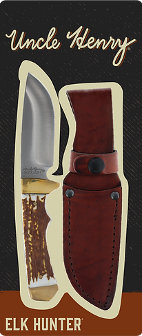

Uncle Henry's product packaging experienced inconsistencies in fonts, layout, and product details. To maintain brand recognition while enhancing the packaging, the background pattern was refreshed, texture was added, and new colors were introduced. The back of the packaging was also redesigned, replacing the plain white background. These updates unified the design, improved product visibility, and effectively communicated essential information to consumers.


.jpg)